
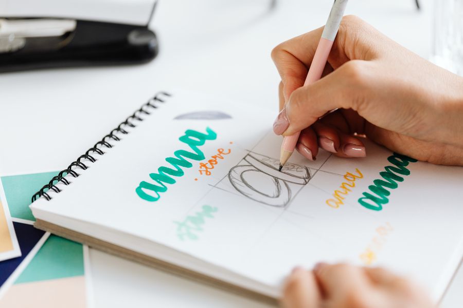
Cursive lettering has a natural charm that makes ordinary words look personal, elegant, and memorable. Whether you want to decorate a journal, create handmade cards, improve your handwriting, or design attractive social media graphics, learning how to draw fancy cursive letters can add character to almost any project.
The good news is that beautiful cursive does not depend on perfect handwriting. It comes from a few repeatable habits: consistent strokes, comfortable spacing, controlled curves, and thoughtful decoration. With regular practice, even beginners can create letters that look polished and artistic.
This guide explains the tools, techniques, letterforms, flourishes, and practice methods that produce attractive cursive writing. You will also find practical examples, common mistakes to avoid, and ways to develop a personal lettering style without making your work look crowded or difficult to read.
Choosing the Right Tools
A smooth writing tool makes cursive practice much easier. Beginners can start with a pencil, gel pen, fine-liner, or basic brush pen. Choose something that moves comfortably across the paper without scratching, skipping, or forcing you to press too hard.
Paper also affects the quality of your letters. Smooth notebook paper works well for everyday practice, while heavier paper is better for greeting cards and artwork. Ruled or dotted paper can help maintain height, angle, and spacing while your hand becomes more confident.
Pencil and Pen Options
A pencil is useful when you are learning basic shapes because mistakes can be corrected quickly. A mechanical pencil gives a consistent line, while a traditional pencil creates subtle variation that can make practice letters look softer and more natural.
Gel pens are excellent for clean monoline cursive, where every stroke has nearly the same thickness. Brush pens create thicker downstrokes and thinner upstrokes, producing a more decorative effect. Try several options before choosing the tool that feels most natural.
Useful Practice Materials
A simple practice setup keeps your attention on movement instead of equipment. You do not need an expensive lettering kit. A few reliable supplies are enough to build control and create attractive results.
A practical starter kit includes:
- Smooth lined or dotted paper
- A sharpened pencil
- One black gel pen
- A flexible brush pen
- A ruler for guide lines
- A clean eraser
- Colored pens for final decoration
Building Strong Basic Strokes
Fancy letters begin with simple strokes. Practice upward curves, downward lines, loops, ovals, hooks, and connecting lines before writing complete words. These movements form the structure of nearly every lowercase cursive letter.
Keep your wrist relaxed and let your fingers guide smaller movements. For longer curves, move from the forearm rather than relying entirely on the fingertips. This produces smoother lines and reduces tension during longer writing sessions.
The Main Stroke Families
Most cursive letters can be grouped into a few basic families. Letters such as i, u, w, and t use repeated arches. Letters such as a, d, g, and q rely on oval shapes. Letters such as l, h, k, and b use tall ascenders.
Practicing these groups saves time because one improved movement can strengthen several letters at once. Rather than copying the alphabet randomly, work through related shapes and pay attention to how each letter begins, turns, and connects.
Controlling Pressure and Speed
Pressure affects the appearance of decorative cursive. With a brush pen, apply light pressure while moving upward and heavier pressure while moving downward. This creates the contrast associated with calligraphy and modern hand lettering.
Speed matters as well. Writing too quickly often produces uneven curves and awkward connections. Move slowly while learning, then gradually increase your pace once the shapes feel familiar. Smooth, controlled motion is more valuable than speed.
Practice Checklist
Use this checklist during each practice session:
- Keep shoulders and wrist relaxed
- Maintain a steady writing angle
- Use light pressure on upward strokes
- Press slightly harder on downward strokes
- Keep letter height consistent
- Leave enough room between words
- Practice slowly before adding decoration
Creating Consistent Letter Height
Consistent height gives cursive writing a professional appearance. The main body of lowercase letters should sit between the baseline and the midline. Ascenders rise above the midline, while descenders extend below the baseline.
Draw faint guide lines if your letters tend to grow or shrink as you write. These lines are especially helpful when creating names, quotations, invitations, or headings where visual balance matters more than natural speed.
Balancing Ascenders and Descenders
Tall letters such as l, h, and k should not look dramatically larger than the rest of the word. Similarly, descenders in letters such as g, j, p, q, and y should extend below the baseline in a controlled way.
Keep the length of these extended strokes fairly consistent. If one descender is very short and another reaches far below the line, the word may appear uneven. Small variations are natural, but deliberate consistency makes the writing look refined.
Managing Spacing Between Letters
Letter spacing controls how easily a word can be read. Cursive letters should connect naturally without appearing pressed together. If the letters overlap too much, the word becomes difficult to identify, even when each individual letter looks attractive.
Pay attention to the spaces inside letters as well. Rounded forms need enough open space to remain clear. Leave slightly more room around wide letters such as m and w, while keeping narrow letters such as i and t visually connected.
Spacing Test
Write the same word three times using different spacing:
- Closely connected for a flowing appearance
- Moderately spaced for everyday readability
- Widely spaced for a formal title or decorative heading
Compare the versions from a distance. The best spacing is usually the one that remains clear without losing the rhythm of cursive writing.
Designing Attractive Lowercase Letters
Lowercase letters create most of the personality in cursive writing. Begin with simple forms, then adjust their loops, entry strokes, and finishing tails. A slightly exaggerated curve can make a letter more elegant without changing its basic identity.
Avoid changing too many features at once. If you make the loops unusually large, add heavy shading, and extend every tail, the word may become decorative but difficult to read. Choose one or two signature features and repeat them consistently.
Refining Common Letter Shapes
The lowercase a can be written with a simple oval and short exit stroke, or with a more traditional double-story form. The lowercase r often benefits from a gentle shoulder rather than a sharp corner. The lowercase s should remain open enough to avoid looking like a small loop.
Letters such as e, f, and z may require extra attention because their decorative versions can become unclear. Practice several variations and select the forms that suit your natural movement. A personal style should feel comfortable, not forced.
Making Lowercase Words Flow
Before adding flourishes, practice complete words using ordinary cursive forms. Words such as “beautiful,” “summer,” “welcome,” and “create” contain different combinations of arches, loops, and descenders.
Write each word several times without lifting the pen unnecessarily. Notice where the movement feels natural and where the connection becomes awkward. Those difficult points show you which letters need adjustment, not more decoration.
Adding Decorative Capital Letters
Capital letters are often the most dramatic part of fancy cursive. Their larger size gives you room to add loops, swashes, and extended entry strokes. However, a capital letter should still be recognizable before decorative details are added.
Start with the basic capital form, then test one flourish at a time. For example, extend the opening stroke of a capital A or add a curved finishing line to a capital S. Keeping the decoration controlled makes the letter elegant rather than overwhelming.
Popular Capital Letter Treatments
A capital L can include a wide lower loop that sweeps beneath the following letters. A capital M may use tall peaks with a graceful entry stroke. A capital R can finish with a long curved leg, while a capital T often works well with a sweeping crossbar.
Try writing your initials in several styles. Compare a simple version, a looped version, and a version with one extended flourish. The best design usually combines clear structure with one memorable detail.
Capital Letter Practice
Practice capital letters separately from words using this
- Write the basic letter ten times
- Add one entry stroke
- Add one exit stroke
- Test a small loop
- Remove any detail that reduces clarity
- Use the strongest version in a complete word
Using Flourishes Without Overcrowding
Flourishes are extended strokes that decorate a letter or word. They can appear at the beginning, end, above, or below the writing. A flourish works best when it supports the shape of the word instead of competing with it.
Before adding a flourish, consider the available space. A long tail may look attractive on a blank page but become inconvenient near the edge of a card. Plan the entire word first, then add decoration where the composition needs movement or balance.
Best Places for Flourishes
Beginning flourishes create a formal entrance into a word. Ending flourishes can underline a name or guide the eye toward the next design element. Upper flourishes work well on capitals, while lower swashes can create a graceful foundation.
Use only the space the design provides. A short word may need one noticeable flourish, while a longer phrase may look better with very little decoration. Repeating the same flourish on every letter usually makes the writing feel crowded.
Flourish Rules for Clear Writing
Follow these simple guidelines:
- Keep the main letter recognizable
- Add decoration after writing the word
- Avoid crossing nearby letters
- Leave room around long tails
- Use matching curves throughout the design
- Stop when the word already looks balanced
Combining Thick and Thin Lines
Line variation gives cursive writing depth and movement. In traditional calligraphy, downstrokes are heavier and upstrokes are lighter. The contrast makes letters appear more graceful and helps the eye follow the direction of each stroke.
If you use a regular pen, you can imitate this effect by writing normally and carefully adding thickness to selected downstrokes. This technique is called faux calligraphy and works well for names, headings, and short quotations.
Creating Faux Calligraphy
Write the word once using a monoline pen. Then identify the strokes that move downward. Add a second line beside each downstroke, leaving the upstrokes thin. Fill the spaces carefully, keeping the added weight consistent.
Faux calligraphy is useful because it does not require a flexible brush pen. It also gives you precise control over the final appearance. Practice on simple words before attempting long phrases or tightly spaced lettering.
When Line Contrast Looks Natural
Line contrast should follow the movement of the letter, not appear as random dark patches. If every stroke is thick, the writing loses its rhythm. If the thickness changes unpredictably, the word may look uneven.
Use moderate contrast at first. Strong contrast can be added later for formal designs, but subtle variation is often more attractive for everyday notes, journals, and handmade cards.
Choosing a Personal Cursive Style
A personal style develops through repeated choices. You may prefer narrow letters, wide loops, rounded forms, sharp angles, heavy downstrokes, or delicate finishing tails. Collect the features that feel comfortable and combine them gradually.
Avoid copying every detail from a lettering artist or online example. Reference styles can help you learn, but your hand will naturally create different proportions. The goal is to build writing that feels consistent, readable, and distinctly yours.
Creating a Style Guide
Keep a small reference page with your preferred alphabet, numbers, punctuation marks, and common words. Include several versions of letters that you are still refining. This page becomes a useful guide when creating larger projects.
Record details such as letter height, slant, loop size, and preferred pen. A style guide prevents accidental changes halfway through a design and helps your writing look unified across cards, labels, artwork, and digital images.
Style Features to Compare
Test these choices side by side:
- Upright letters or a rightward slant
- Rounded loops or narrow loops
- Short tails or extended swashes
- Thin monoline writing or bold contrast
- Compact spacing or generous spacing
- Simple capitals or decorative capitals
Writing Words and Phrases Clearly
A beautiful word still needs to be readable. Write the phrase in ordinary handwriting first so you can check spelling, spacing, and overall length. Once the structure is correct, convert it into your chosen cursive style.
Long quotations require more planning than short names. Divide the phrase into natural sections and decide where the largest words or decorative capitals should appear. This creates hierarchy and prevents every word from demanding equal attention.
Using Emphasis in Lettering
You can emphasize important words through size, line thickness, color, or decoration. A name may use a large capital and a sweeping underline, while supporting words remain smaller and simpler.
Do not emphasize every word. Too many large letters make the design feel flat because nothing stands out. Select one central feature and let the remaining text support it with consistent, quieter forms.
Improving Difficult Letter Connections
Some letter combinations naturally create awkward transitions. For example, the connection between r and n or o and v may feel cramped. Adjust the exit stroke of the first letter or simplify the entry stroke of the second.
Write difficult pairs repeatedly in isolation. Then place them inside short words. This focused practice helps your hand memorize the movement and prevents hesitation when you write complete phrases.
Common Connection Problems
Watch for these issues:
- A sharp corner between rounded letters
- A loop that closes too tightly
- An exit stroke that rises too high
- A connector that crosses another line
- A letter that loses its identity after joining
- Uneven spacing caused by hesitation
Practicing With Structured Exercises
Random practice can be relaxing, but structured exercises usually produce faster improvement. Spend a few minutes on strokes, then individual letters, followed by connections and complete words. Finish with a short phrase written at a natural pace.
Keep sessions brief enough to maintain concentration. Ten to fifteen focused minutes can be more useful than an hour of tense writing. Stop when your hand becomes tired, because fatigue often creates habits that are difficult to correct later.
A Simple Weekly Routine
On the first day, practice basic strokes and lowercase families. On the second day, work on capital letters. The third day can focus on spacing and connections, followed by faux calligraphy and flourishes later in the week.
Reserve one session for a complete project, such as a quote, greeting card, or journal heading. Reviewing finished work helps you see which improvements are becoming natural and which movements still need attention.
Tracking Progress
Keep samples from your first practice session and compare them with later pages. Look for changes in consistency, spacing, pressure, and confidence rather than expecting perfect results immediately.
Mark one improvement goal for each session. You might focus on keeping the baseline steady one day and making smoother loops the next. Small, specific goals make practice more productive and easier to evaluate.
Creating Decorative Projects
Once your letterforms feel reliable, apply them to practical projects. Try writing a name on a gift tag, creating a quote for a frame, decorating a recipe card, or adding a heading to a scrapbook page.
Begin with small surfaces. Short projects give you room to experiment without becoming frustrating. As your control improves, move to larger layouts, layered colors, borders, and more complex compositions.
Project Ideas for Beginners
Consider these approachable projects:
- Personalized bookmarks
- Handwritten place cards
- Inspirational wall quotes
- Greeting card messages
- Decorative journal headers
- Gift tags and labels
- Recipe titles
- Handmade envelope designs
Pairing Cursive With Other Elements
Cursive lettering can work alongside leaves, stars, dots, ribbons, and simple geometric borders. Keep supporting elements lighter than the main text so the words remain the visual focus.
Color can also add personality. Black lettering with one muted accent color often looks polished. Bright colors may suit children’s projects or celebrations, while neutral tones are effective for wedding stationery and minimalist designs.
Digital Uses for Cursive Lettering
Handwritten letters can be photographed or scanned for use in digital projects. Use bright, even lighting and place the paper on a flat surface. A clean scan preserves thin strokes and makes the background easier to remove.
Digital lettering can appear in logos, social media graphics, invitations, printable worksheets, and website headers. If you plan to enlarge the artwork, create it at a high resolution so the edges remain sharp.
Preparing Lettering for Scanning
Write with dark ink on clean white paper for the easiest results. Avoid shadows across the page and make sure the camera is directly above the artwork. Crop the image carefully while preserving the full shape of each flourish.
You can also write several versions of the same word and choose the strongest one digitally. This allows you to combine the best capital, spacing, and finishing stroke without rewriting the entire design.
For more ideas, see our guide to [hand lettering practice techniques] and learn how to build a consistent lettering routine.
Avoiding Common Beginner Mistakes
Many beginners focus too heavily on decoration before strengthening the basic letterforms. Large loops and long swashes cannot hide uneven spacing or unclear shapes. Start with simple writing and add visual details only after the structure looks stable.
Another common mistake is pressing too hard. Excessive pressure creates stiff lines, tired hands, and inconsistent thickness. Hold the pen gently and allow the tool to create the line variation. Relaxation improves both comfort and appearance.
Mistakes That Reduce Quality
Avoid these habits:
- Writing every letter at a different angle
- Adding flourishes before checking spelling
- Making all letters equally large
- Using too many colors
- Copying a style that feels uncomfortable
- Practicing only complete words
Correcting Errors Gracefully
Small mistakes do not always require starting again. If a letter is slightly uneven, continue the word and assess the overall appearance afterward. A minor variation can look natural when the surrounding letters are balanced.
For finished artwork, plan a clean correction method. You may cover a mistake with an illustration, crop the design, rewrite the word on a separate layer, or begin again on fresh paper. Choose the solution that protects the final composition.
How Long Practice Takes
Most beginners notice better control after several short sessions, especially when they practice the same movements repeatedly. A polished style usually takes longer because it requires consistent spacing, confident connections, and reliable pressure.
Progress is rarely perfectly steady. Some days the letters may feel smooth, while other sessions produce uneven results. Focus on repeated practice rather than judging one page. Skills improve through accumulated movement and careful observation.
Making Practice More Effective
Use the same pen and paper for several sessions so you can identify changes in skill rather than changes in equipment. Practice at a comfortable desk with enough light, and keep your reference alphabet nearby.
Take occasional breaks to stretch your fingers and rotate your wrist gently. If pain continues, stop writing and adjust your posture or grip. Lettering should create controlled movement, not physical strain.
Building Confidence Through Repetition
Confidence comes from familiarity. When the hand has repeated a movement often enough, you no longer need to think about every curve. This frees your attention for spacing, layout, and decorative choices.
Write the same word in several sizes and styles. Repetition reveals which shapes feel natural and which ones become unstable when enlarged or reduced. That information helps you choose the right style for each project.
Using Reference Examples Wisely
Reference alphabets can show how letters are constructed, but they should be treated as study material rather than strict rules. Observe the direction of strokes, the placement of loops, and the relationship between thick and thin lines.
Copy a few letters slowly, then close the reference and write them from memory. This encourages genuine control and helps prevent dependence on tracing. Over time, your lettering will become more natural and personal.
Moving From Practice to Finished Work
Before beginning a final piece, create a rough layout. Estimate the width of each word and leave room for flourishes, borders, or illustrations. This prevents the last letters from being squeezed into an awkward space.
Write the final version with a steady rhythm. If possible, test the complete phrase on a similar piece of paper first. A short rehearsal can reveal spacing problems and give you the confidence to complete the finished design cleanly.
Final Quality Check
Review your work for:
- Correct spelling and punctuation
- Even baseline alignment
- Consistent letter height
- Comfortable word spacing
- Clear capital letters
- Balanced decoration
- Clean edges and background
Conclusion
Beautiful cursive lettering comes from control, patience, and thoughtful design rather than expensive supplies or naturally perfect handwriting. Begin with basic strokes, practice related letter shapes, and pay close attention to height, spacing, pressure, and connections. These small details create the polished appearance people often associate with professional calligraphy.
As your confidence grows, add capital flourishes, faux calligraphy, color, borders, and personalized style choices. Keep decoration secondary to readability, especially when writing longer phrases or creating practical items such as invitations, labels, and journal headings.
The best way to learn how to draw fancy cursive letters is to practice consistently with clear goals and review your progress over time. Write slowly at first, keep your hand relaxed, and let your style develop through repetition. With regular effort, simple tools can produce lettering that feels elegant, expressive, and genuinely your own.
FAQ
What is the easiest way to start learning cursive lettering?
Begin with basic upstrokes, downstrokes, ovals, loops, and connecting lines. Practice lowercase letter families before writing full words. A pencil or smooth gel pen is usually easier for beginners than a flexible brush pen.
Which pen works best for fancy cursive writing?
A brush pen creates attractive thick-and-thin lines, while a gel pen provides smooth monoline writing. Beginners can also use a regular pen with faux calligraphy to add thickness manually to selected downstrokes.
How can I make cursive letters look more elegant?
Focus on consistent height, relaxed curves, even spacing, and controlled pressure. Add one or two carefully placed flourishes rather than decorating every letter. Clear structure usually makes lettering appear more elegant than excessive detail.
How long should I practice cursive lettering each day?
Ten to fifteen focused minutes is enough for steady progress. Divide the time between strokes, letter groups, connections, and complete words. Short daily sessions are generally more effective than occasional long periods of tiring practice.
Why does my cursive writing look uneven?
Uneven writing often results from changing letter height, inconsistent slant, rushed movement, or excessive hand pressure. Use guide lines, slow down, relax your grip, and practice difficult connections separately before returning to complete words.
0 Comments